How I had to design a logo for Coca-Cola (pretending) based on the 70s design trends
Hello again ppl, in this storytime session, I’ll be reminiscing about not so long ago, like a couple of weeks ago or a month even.
This time’s assignment was actually kinda interesting for once: We made groups and each one was given a decade (from the 50s to the 90s) to work on designing cans, packaging, a poster and some stickers of a limited edition of Coca-Cola. Btw originally it also included the 00s which I really enjoy, however Teach said that it recycled a lot of stuff from before, which I mean, come on, doesn’t everything take things from the past?
So whatever, byebye chance to do some Frutiger Aero type shii, but luckily me and my team got probably my second most favorite decade: the 70’s.
Tbh, the organization between the team wasn’t great so pretty early on I was just like: “Imma do the logo and the packaging” because between me and you, those ninjas were going to do something ok at best and I wanted it to look a certain way so that gave me more control of the outcome.
Oh and there was also this thing, that at least one person in the team had to dress up according to the decade, so I was kinda looking forward to that because I have some clothes that fit with that. However, we’re here today to talk about the logo so let’s do that.
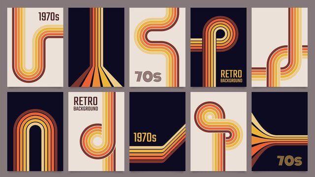
Looking through references, at first I didn’t really have an idea of what to make for the logo, but then while also sketching the idea for the packaging I came up with this:
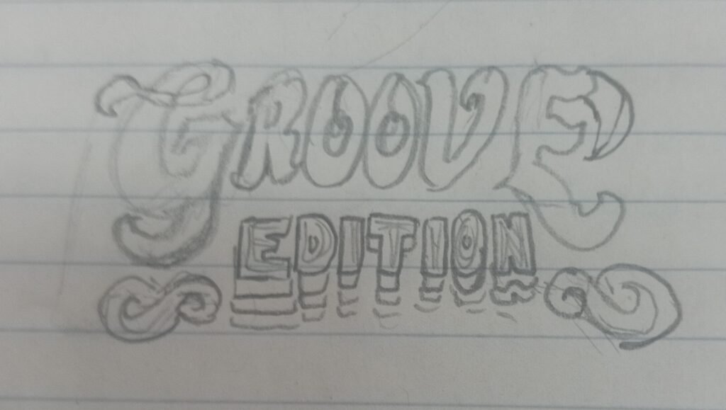
First of all, the name of the thingy had to be 70s Groove Edition so I kinda pictured the “Groove” part being bigger with a psychedelic type font and the “Edition” part being smaller and with the like sort of repetition with colors that was pretty common during the 70s
The Groove in that first sketch I kinda just pulled out my ass cuz I didn’t know how to properly do that font style, I just did like fat and bubble like, also with those weird ahh thingies on the sides of the Edition that were just detail that really wasn’t going nowhere.
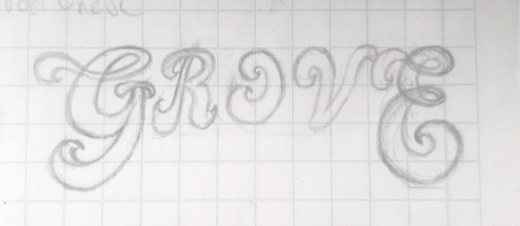
I thought it was going to be harder to digitalize that shit but with the pen tools in vectors I got it clean.
One little challenge I found was searching for the right feel font for the Edition, since the other part was hand drawn. I went diving into the deep web of Google Fonts and found a couple of interesting ones. Such as Monoton, Danfu, Plaster, Bagel Fat One and Holtwood OneSC.
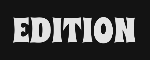


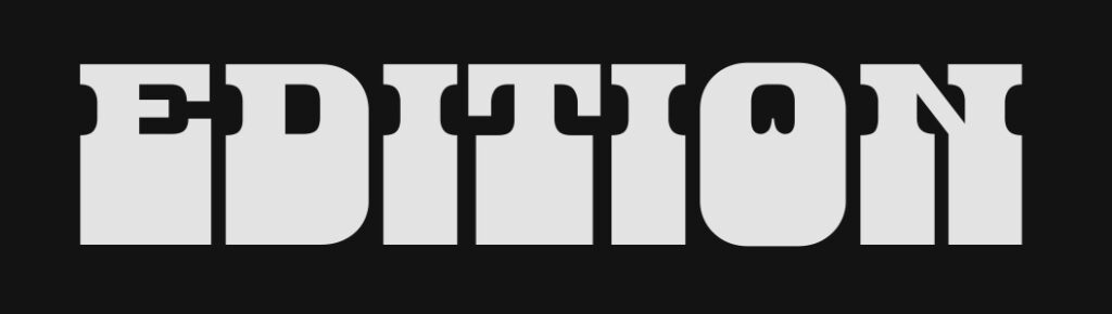
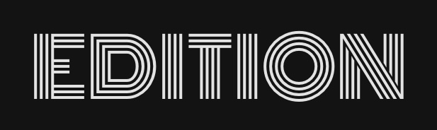


After doing some color testing…
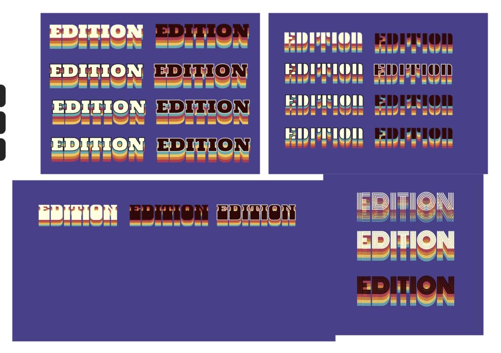
I chose the Danfo font with dark color and light lines (third in the lower left corner).
Finally, I slightly curved that and put it together with the upper part. Here’s the result:
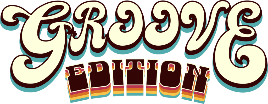
Ok so that’s the story of my Groove Edition logo, hope you were entertained, and see you in the next entry, this time with the story of this same project’s packaging and, oh boy… it was quite the thing to get it to work.
Peace.